step by step

Watercolor Portrait Step by Step (Theo)

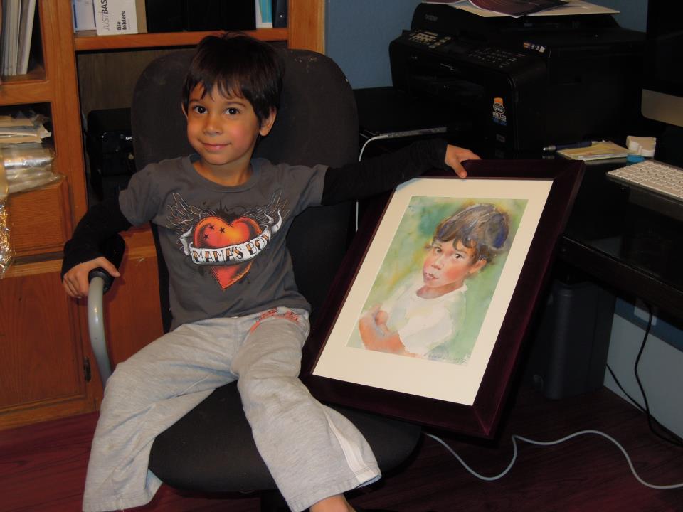
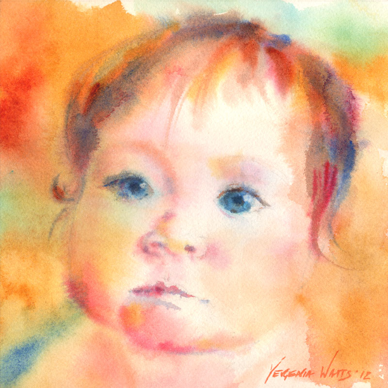
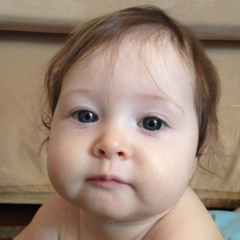
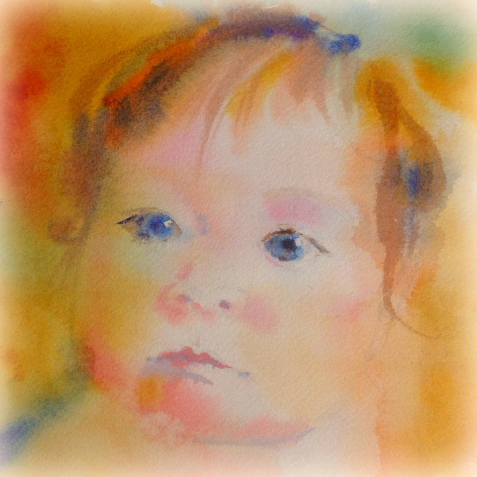
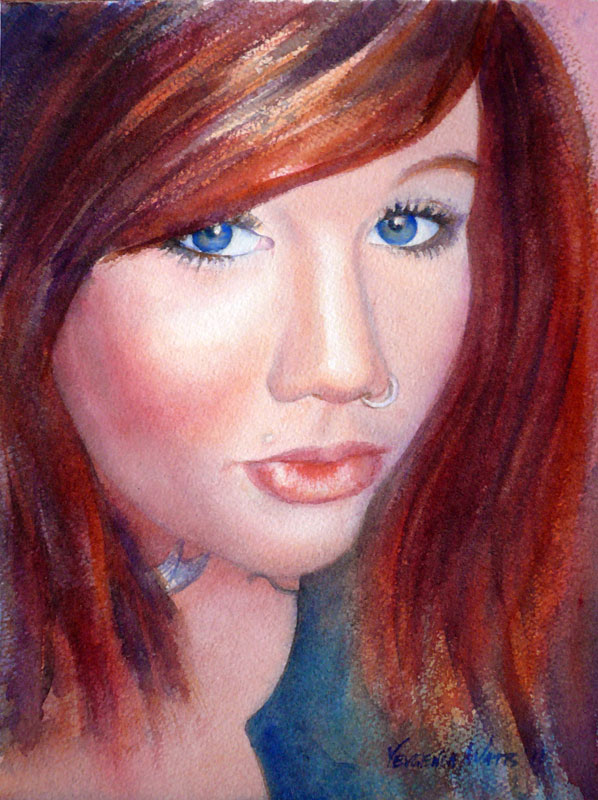
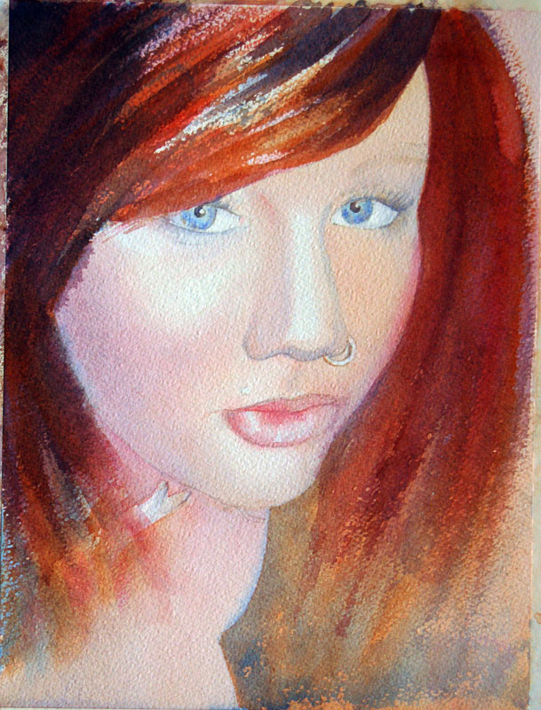
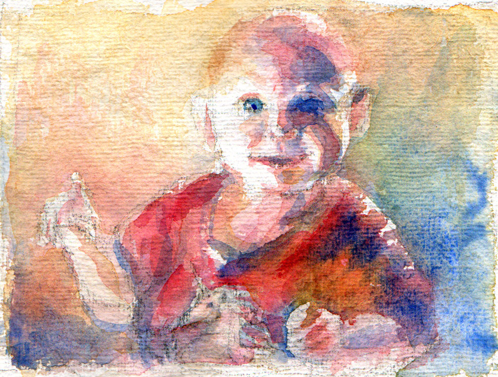
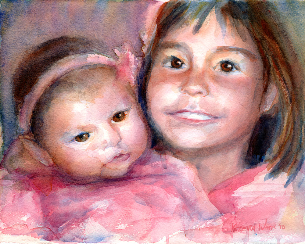
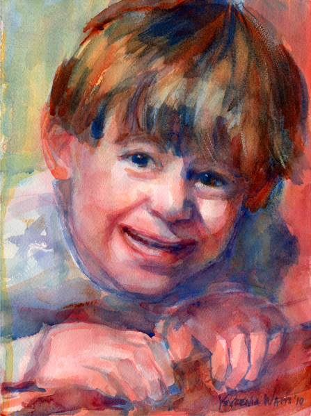
This is Theo, the little brother of Simon, whose step-by-step portrait I posted a while ago.

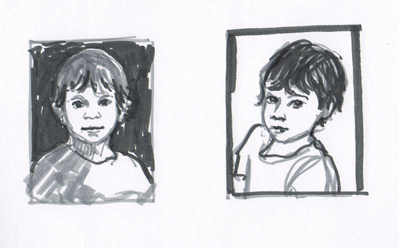
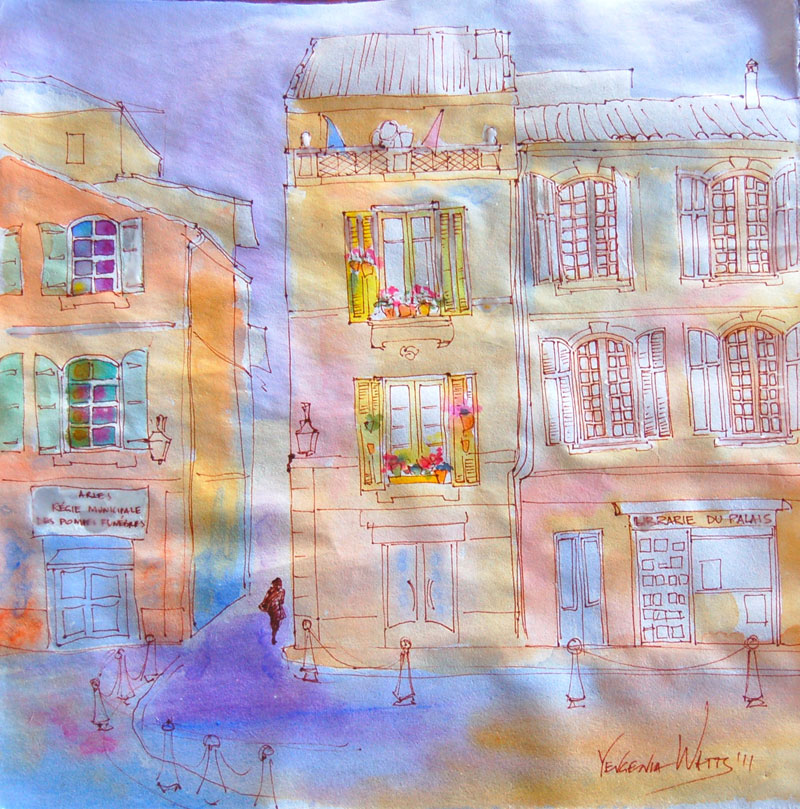
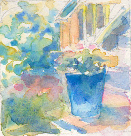
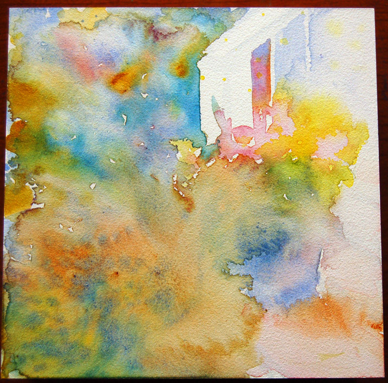
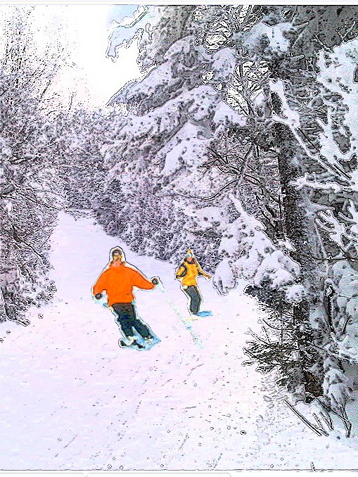
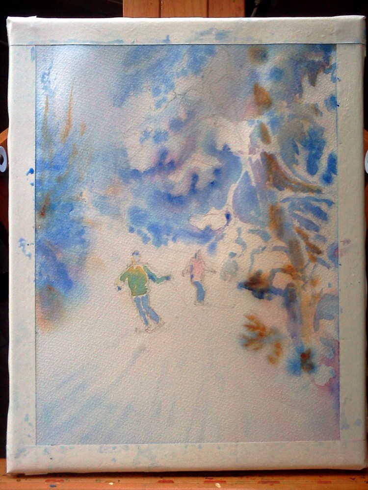
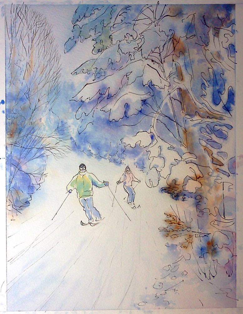
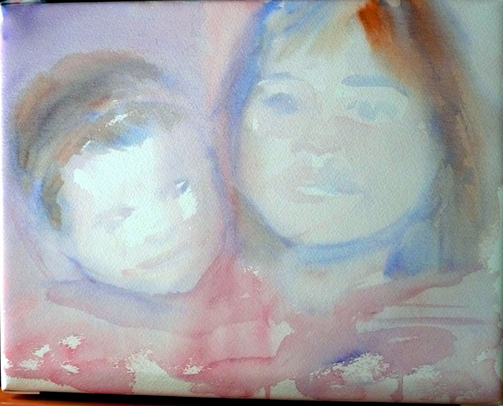
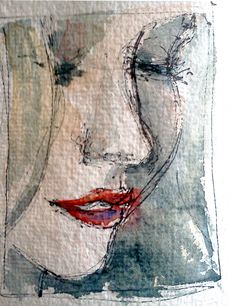
Step 1. Thumbnail sketch, in color:

I use thumbnail sketches like these for three purposes:

1. This is the initial translation of a photo to an artwork that I do. It lets my collector see what I see when I look at their photo. It gives them a rough idea of the final result.

2. In the absence of a live model (not that I paint dead models...wait, yes, I do...) - anyway, most of the time, people, kids especially, do not sit for my portraits. They send me photos and these photos are the only source of information about them that I have. So, spending some time with the pictures, and making these little sketches of them, is a way for me to get to know them a little better.

3. Finally, these sketches are essential tools I use for planning my paintings. How much of the photo do I crop? Do I need to rotate things? Move something? Delete something? Which colors will I use? Which values will work best? All of these questions can be worked out in advance, in a thumbnail sketch.

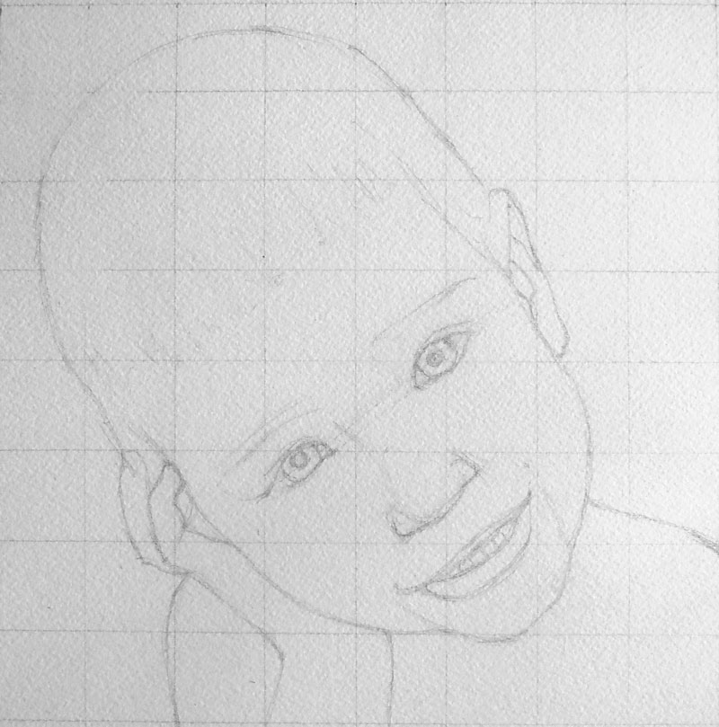
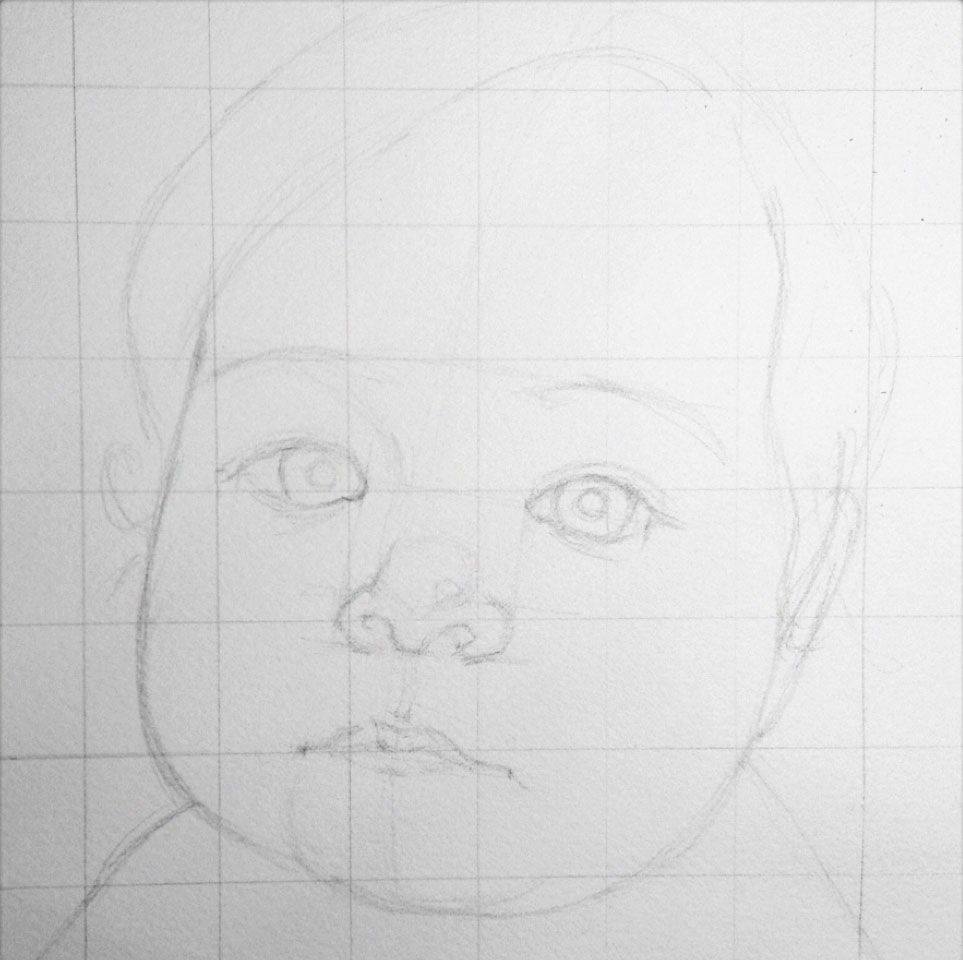
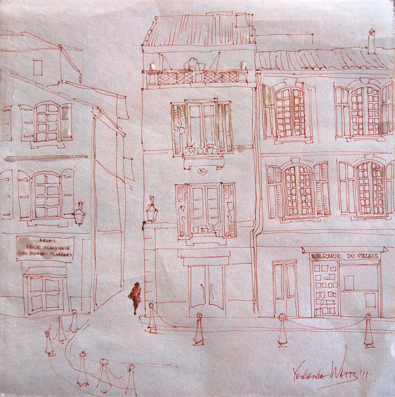
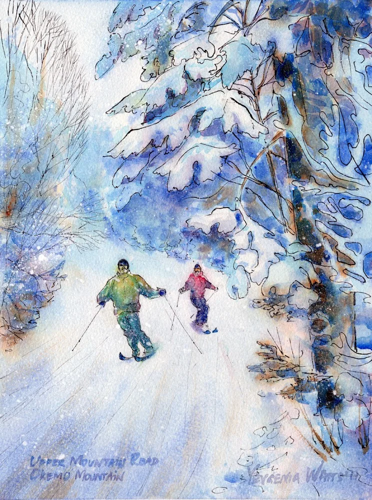
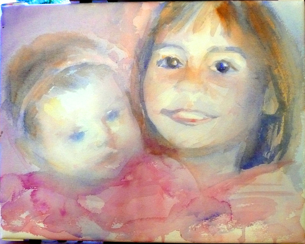
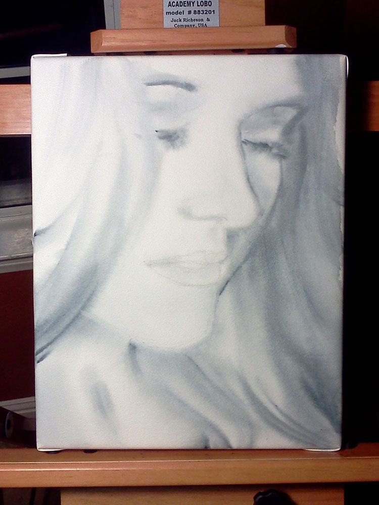
On to Step 2, Drawing.

I used grid method for this drawing. I won't go into detail on how to do it here but I am including it into the bonus chapter of my "How I Paint Children" ebook, which you will be able to get very soon (and if you are on my email list, you will be the first to get it. For free.)

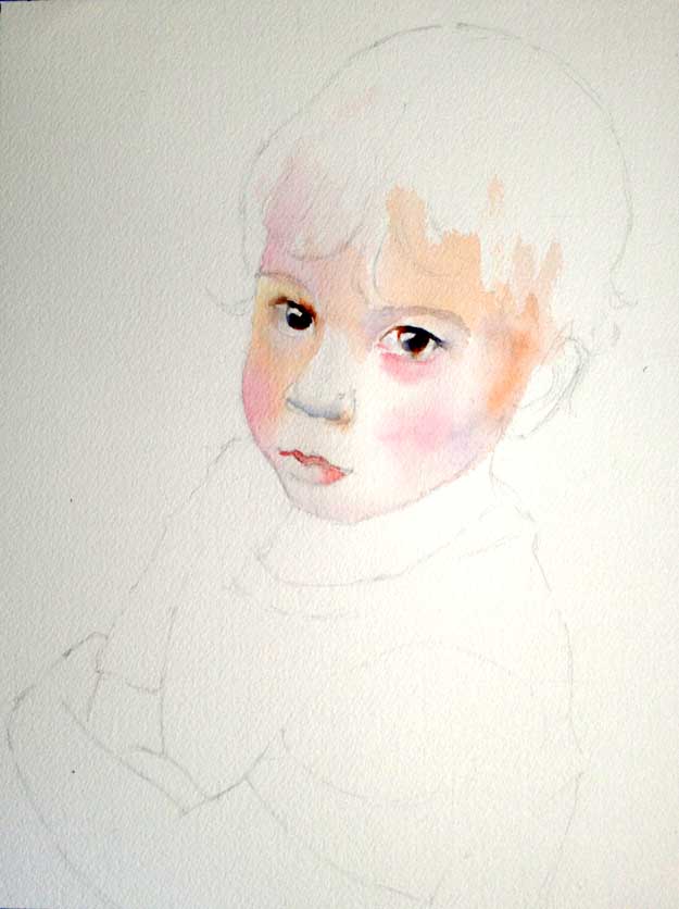
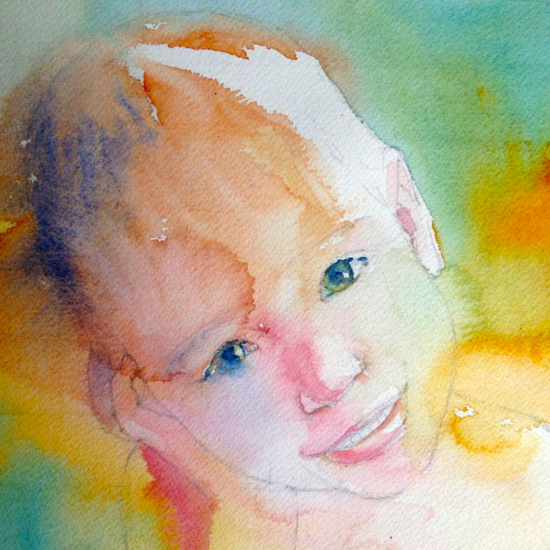
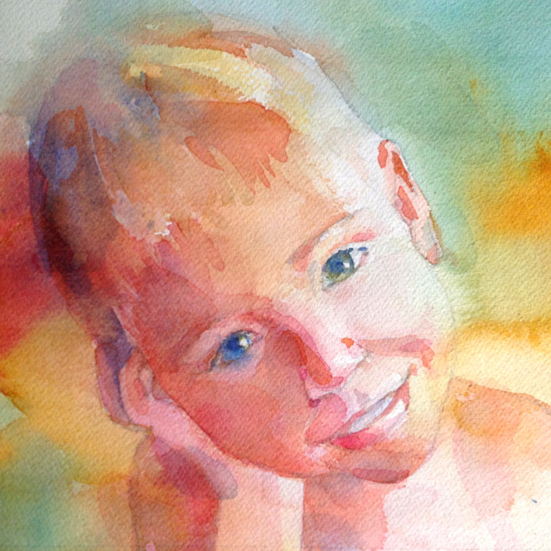
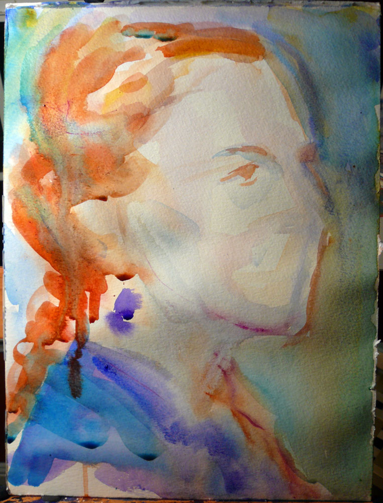
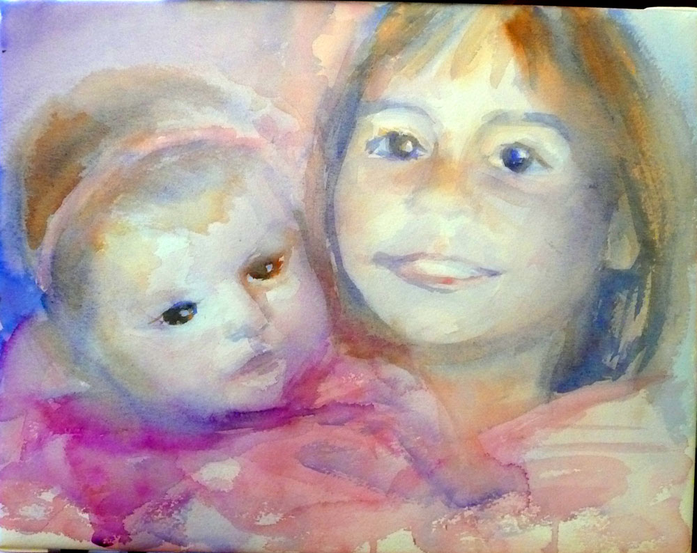
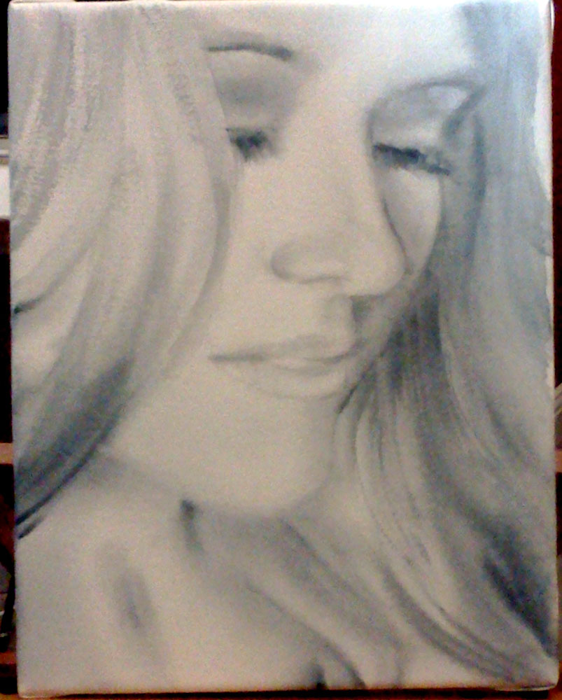
Step 3. First couple of layers. I keep things very wet at this point and paint runs all over the place. Yes, the green background bled into the boy's face but that's okay. Keep reading :)

Step 4. Once my first wash was dry, I lifted off some of the green on his face and began adding definition to the shadow areas.

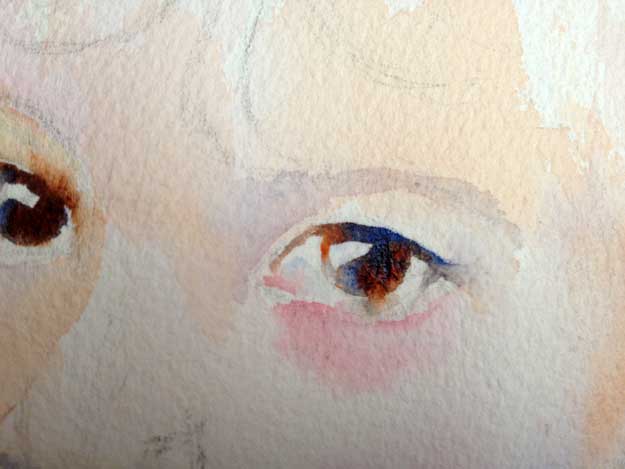
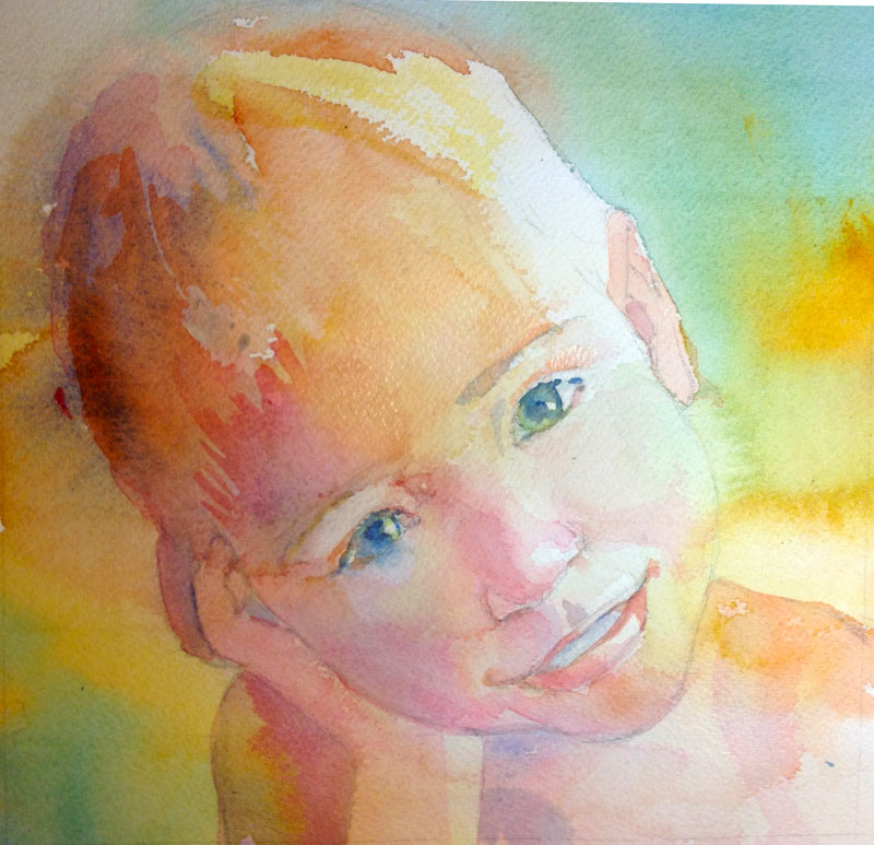
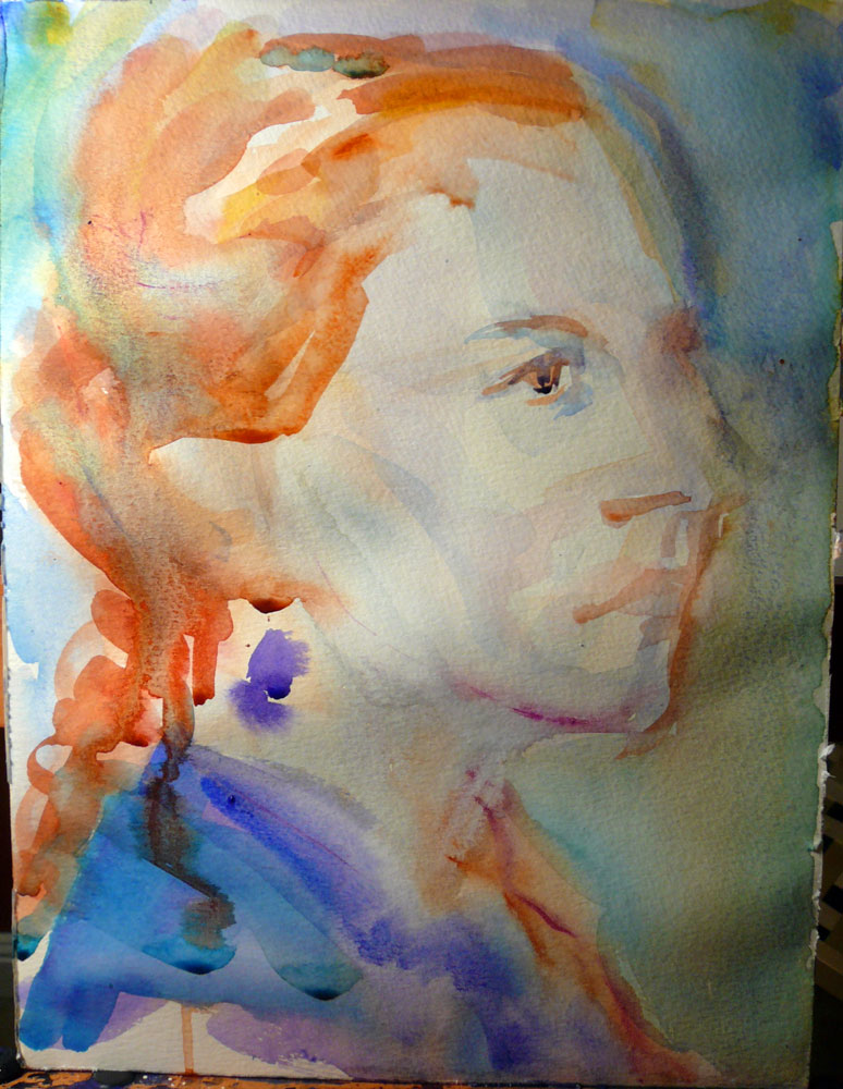
Step 5. Adding light blue washes on his forehead, chin, and above his eyes. Defining his eyes, nose, lips, and ears more. More texture along the hairline.

Step 6. I don't always do it, but in this particular portrait, I smoothed out much of my brushwork on face. This will give the painting a more finished, detailed, and polished look. For that, I use a soft synthetic brush. Here's my favorite one:

This is a Cotman 1/2" flat brush but any softish synthetic brush will do. I originally bought it for the one and only watercolor class I took in the U.S., and it didn't take as a painting brush. It's great for blurring the edges though.

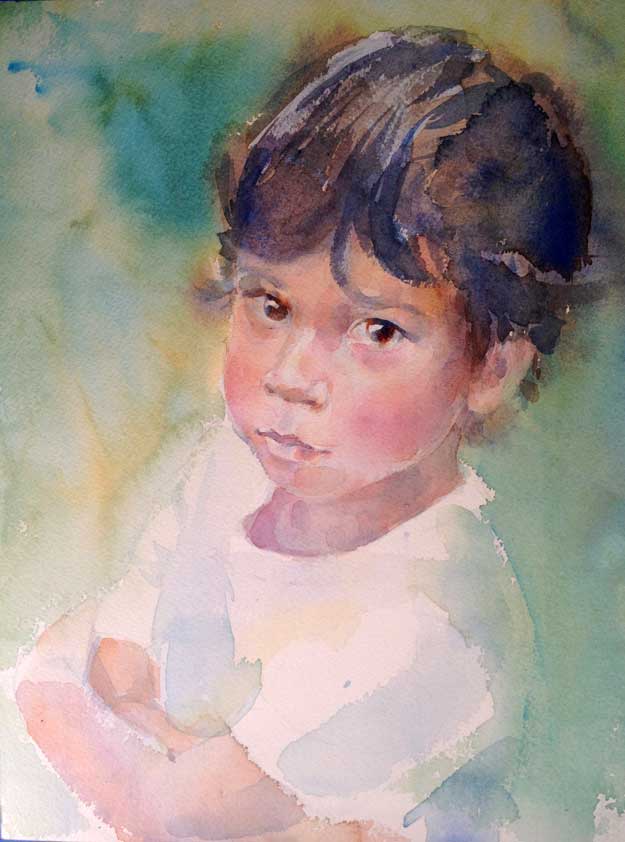
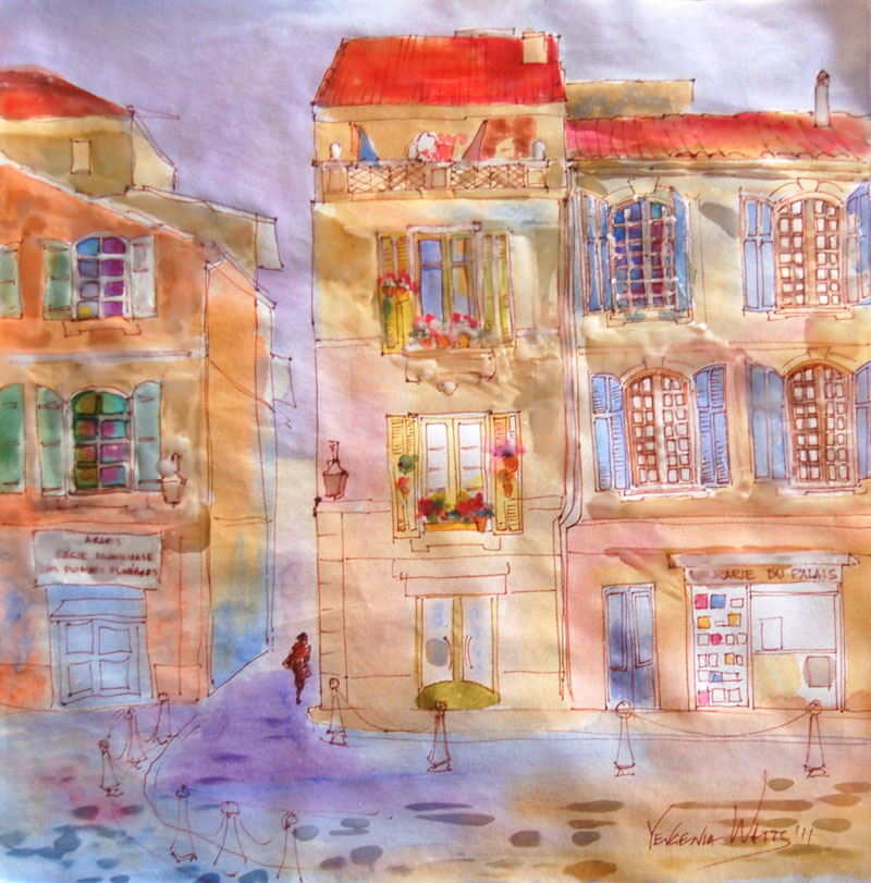
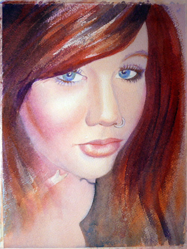
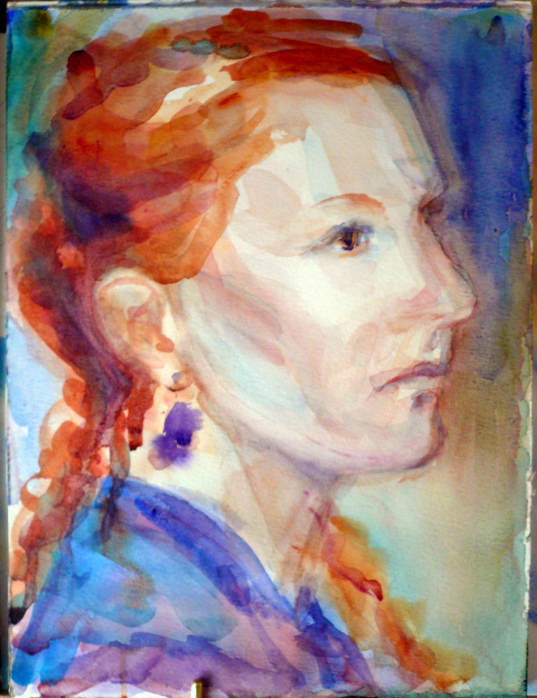
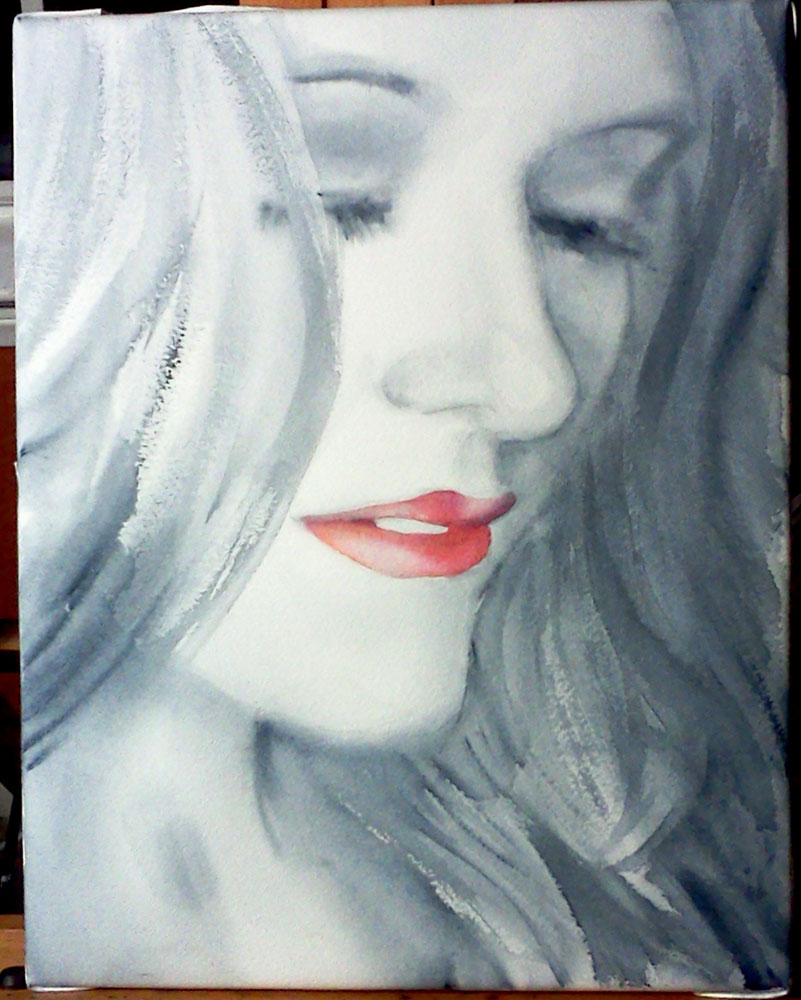
Step 7. I added another background wash to deepen the color. A little more fiddling with the details.

Step 8. The background wash left a hard edge around the head (phtalo blue tends to do that). So I softened the edge and lifted off some hairs here and there. Done!

Simon - A Watercolor Child Portrait Step by Step

Some time last year, I had the pleasure of working on two custom portraits for Laura of http://tinyscissortimes.blogspot.com/. I painted her two sons, adding to her growing collection of family portraits created by different artists. It was fun! She let me choose from several reference photos and we worked together to arrive at paintings that made both of us happy. She is pretty much my perfect client :)

10 x 8" Watercolor on Arches cold press 140lb watercolor paper.

This is one of those portraits. Simon is the older kid and Laura wanted a painting based on one of her favorite photos of him as a toddler. I typically advise for the reference photos to have a strong light and shadow pattern, preferably in natural light and to avoid pictures taken with a flash or those with softer, diffused light, or back light. This just happened to be a backlit photo. If you are a beginning painter, it could make things difficult. The variation of values in the face becomes very subtle and you need a good understanding of facial structure to make it convincing. But it is doable and incidentally, two of my portraits I'm rather fond of have back light:

(Both of them also have step-by-step posts, here and here).

As always, I started with a thumbnail sketch:

I do this to get a general feel for the personality and mood of my subject and to give the client an idea of the end result. Sometimes I do more than one sketch, trying out different compositions, crops, colors, value schemes. Once the sketch is approved, I move on to the drawing:

You can barely see anything here because in portraits, I tend to keep the drawing minimal. I don't map out areas of light and shadows and prefer to that with paint. This drawing was made using grid method directly on the watercolor paper.

On to the next step, initial washes:

Very lightly, I mapped out main shadow areas, while leaving most highlights as the white of the paper. From now on, it's building up the layers with the general idea of keeping the color cooler in the shadows and warmer in the lights.

Some more form modeling here. Still keeping the highlights white.

Most of the time, my portrait palette consists of a yellow, a red, and a blue. Sometimes, there is an additional version of each color - a cool red (quinacridone red), a cool yellow (quinacridone gold), a warm yellow (indian or hansa yellow), and a warm blue (french ultramarine or cobalt). In this painting, I also had small areas of phtalo blue (cool blue).

Getting close to done. This image looks a bit pale compared to the previous one because of the different lighting when I took the pictures. I softened some of the edges and signed it. I felt that it was at the stage where it was still lively but not overdone. When I sent it to Laura for approval, however, she wanted a greater level of detail and depth. And so the work continued:

Working with smaller brushes, increasing value contrast (i.e. making dark things darker next to light things, which makes them pop), softening some edges.

And the finished, color-corrected version!

She loved it. :)


Day 24 - Casa Del Desierto (Barstow Harvey House)

Finally done with this painting! I started it on a plein air outing over a week ago and worked on it in tiny pieces of time since. It even went through an ugly stage (which is normal, particularly for paintings done in multiple sessions) and through a husband-critique stage (that's how you know it's getting serious ;) ). I

Watercolor and ink on hot press paper. Original sold. Prints and cards available.

A few progress photos:

IMG_20140114_161127816.jpg

First step: completed drawing at the plein air session. By the time I was done drawing, it was getting close to sunset and windy, so I decided to do the painting part at home.

harvey-house-progress.jpg

Here, I am beginning to lay first washes. The paper is hot press, so I'm getting some nice blooms!

harvey-house-ip3.jpg

I have some white areas left here but most of the painting has a layer of paint. Evaluating if the contrast between the white columns and dark spaces between them is too dark. So it is. Also, not crazy about the foreground.

harvey-house-ip5.jpg

One step further: I toned down the white areas and lightened up the shadows between columns. I also decided to separate the far right side of the building from the background by darkening the tree area. The foreground got another wash of gray-blue to tone it down and ground the building. Brick detail on the left side and a bit of cleaning up in the shape of the columns and bottom of the building.

harvey-house-ip4.jpg

At this point, I got a feeling that my problem with the foreground might be because it was also too large. I began thinking about the best way to crop it.

Harvey-House.jpg

Final, cropped version. The foreground is significantly darker and quieter. I took off some of the paint first, by wetting the area with a soft brush (to agitate the paint and make it liftable without damaging the paper) and blotting with soft tissue paper (like Kleenex). I repeated the process once or twice. Then, I covered the area with a fairly uniform wash of mixed gray (French Ultramarine + Quinacridone Red + Quinacridone Gold).

And that's the story :). I think I've lived in the desert for too long (4 years!), because I am beginning to find cool things about it and even like some of them...

If you would like to see an excellent virtual tour of the Barstow Harvey House, watch this:

A Portrait A Day 44 - Christina - step by step

This painting was a commission I got through Etsy's custom requests section - Alchemy. It is a Christmas present for the person depicted. I do hope she will like it :). Since it was a custom request, I worked a bit bigger than usual (this is an 11x14, which makes her face a lot bigger than life size) and finally found use for my tube of Payne's gray (I never use it otherwise). The client said that the resulting painting was "exactly what she envisioned" - which is nice. But if you are at least a little familiar with my work, you know that working in grayscale must be pure torture for someone who loves color so much! I can't say that it was torture - and I even kind of liked it before adding the red lips - but I promise you, the next post will have COLOR! :)

This is probably not the most interesting painting to show step-by-step photos for, but I made this anyway so that the client could keep track of where I was in the process. Here they go:

christina sketch
christina sketch

Step 1 - the idea sketch. We decided on showing a bit more of her face and neck. I did the grayscale first, then added the bright red lips, and then, wanting more color, I tried adding a bit of pale color. I wasn't sure at this point if I would add the pale color in the big painting or not.

day 44 christina step 1

Step 2 - the drawing...what usually takes the most time. I skip this step in my portraits-a-day but I felt that I need to do a drawing here because the face was so much larger than life size. I used the grid method to establish major points in the drawing.

christina step 3
christina step 3

Step 3 - wet-into-wet. I liked it quite a lot at this point.

child peeking out easel

Oh yes! Meet my new easel! It's a Richeson Academy Lobo and I love it so far (as does my son, who thinks it's an excellent play gym).

christina step 4
christina step 4

Step 4 - more detail, deeper shadows

christina step 4
christina step 4

Step 5 - the red lips!

christina step 5
christina step 5

Step 6 - the final version, with some areas corrected, deepened and more detailed.

Here it is.. Here are also the holidays, my family, more commissions, and a lot of material to post. Hopefully, I will find the time for a couple more blog posts before the New Year, but if not - Merry Christmas and see you in 2011! :)

Girl with grape-vine, and another child portrait

Good morning...I think I would pay somebody to let me sleep in on a Sunday morning. I worked on two portraits yesterday, one commission and the other a painting of my husband's little niece. I saw a photo of her wearing a bright multicolored scarf and I just had to make a painting! :) Here are pictures at the beginning and at the end of the day. You can definitely tell which one I worked on more:

And the little girl:

Both of the subjects are back-lit (contre-jour!), and in the case of the girl with grape-vine, there is also flash from the camera, all of which makes working on it a little confusing. I find myself inventing the shadows and lights on her face, and it feels like her whole face should be much darker.